Overview
Welcome to my sitereport.
This report details my journey in learning web development, coding, design, debugging process and my experience throughout the whole development cycle of this website.
I used Sublime Text as my code editor but later on switched to Visual Studio Code because of its powerful features and extensive plugin ecosystem.
Learning HTML and CSS
My journey began with learning the fundamentals of HTML and CSS.
HTML, the backbone of web pages, allowed me to structure my content effectively. I learned about different tags, attributes, and the importance of structure in HTML.
CSS brought life to the structure by enabling me to style and layout the elements. I explored various properties, selectors, and learned about the box model, positioning, and responsive design techniques. This foundational knowledge was crucial in building a visually appealing and user-friendly website.
Learning Git and Github
Version control became an integral part of my development process, and learning Git and GitHub was a significant milestone.
Git allowed me to track changes, and manage different versions of my code. I began by learning fundamental commands such as git clone, git add, git commit, and git push.
GitHub provided a platform to host my repositories and showcase my projects. I learned how to create repositories, make commits, push changes, create branches, and merge them. This knowledge not only improved my workflow but also prepared me for collaborative projects in the future.
Design Layout
Each page uses a similar overall layout using the flex property except, the projects page where grid layout has been used.
The typography is clean and easy to read, with the use of 'Courier new, Courier, monospace' font family. I used different font sizes, weights, and styles to create a hierarchy and improve readability. The layout is responsive, adapting to different screen sizes and devices, ensuring a consistent user experience.
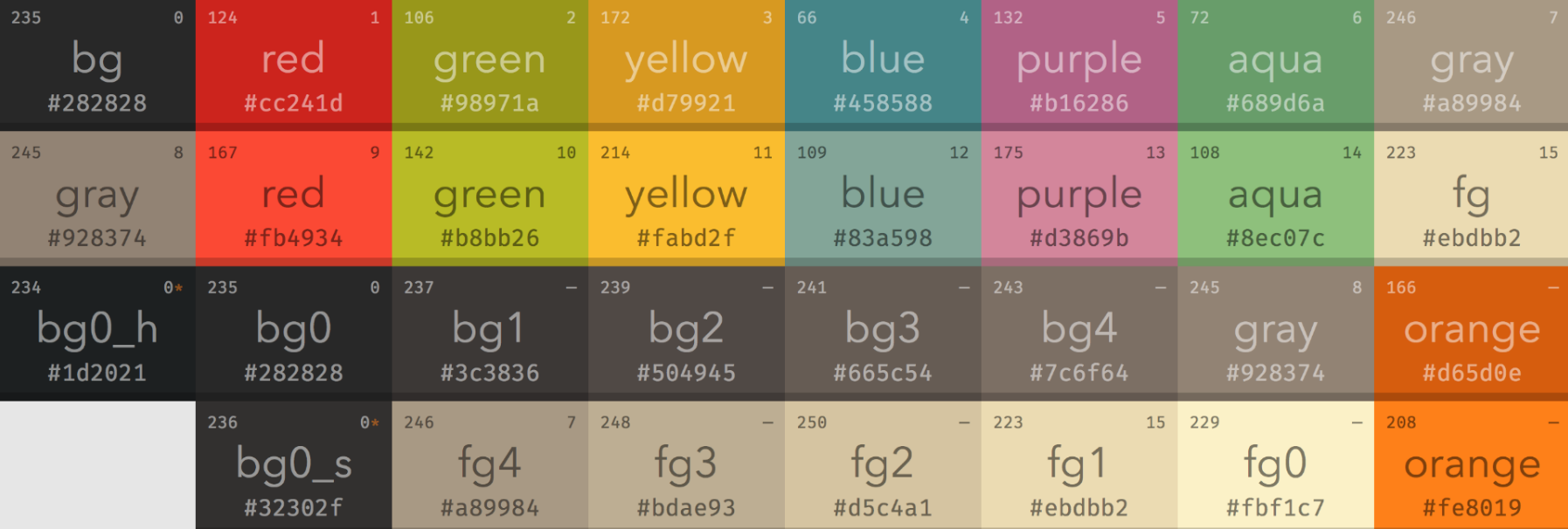
I took inspiration from the gruvbox theme which is a popular color scheme designed primarily for text editors and terminal emulator, known for being easy on the eyes and visually appealing. The color scheme is consistent throughout the website, creating a visually appealing design.
The following image is the color palette of the gruvbox theme that I have used for this website:
Navigation Bar
The navigation bar is a crucial component of the website, providing easy access to the different pages. I designed a responsive navigation bar that adapts to various screen sizes.
Using a little bit of Javascript, I created a hamburger menu which only appears on mobile devices. This approach improved the overall usability and accessibility of the website.
Although this assignment is focused on HTML and CSS, I used javascript to create the hamburger menu. This is highlighted in the Challenges and Solutions section of this sitereport.
Homepage
The homepage serves as the landing page of my portfolio website. It includes an image of me, an introduction, links to my github and linkedin pages, and some information about me.
I used a combination of images, text, and social links to create a welcoming and visually appealing homepage. The layout is clean and organized, making it easy for visitors to navigate and explore the website.
Projects
Grid property has been used in order to display the 6 projects.
Since, this is our first assignment, the projects are not linked to any other page and placeholder images have been used. However, in the future, I plan to link them to their respective project pages.
Contact
The contact page provides visitors with the means to get in touch with me. It includes a contact form, social media links, and other relevant contact information.
I ensured that the form is user-friendly and accessible, using appropriate placeholders. The social links are easily accessible, allowing visitors to connect with me on different platforms.
Video Demonstration URL
The video demonstration provides a visual walkthrough of the website, showcasing its features and functionality.You can view the video demonstration here:
Watch the Video Demonstration
This video highlights the design, navigation, and key elements of the website, offering a comprehensive overview of the project.
Responsive Design
Ensuring that the website is responsive was a priority throughout the development process. I used media queries and flexible layouts to make the website adaptable to different screen sizes and devices.
This involved rigorous testing using Chrome Developer Tools and making adjustments to improve the user experience. The goal was to provide a seamless and consistent experience across desktops and mobile phones.
Challenges and Solutions
Initially when researching on ways to include the hamburger menu, I only found results that included javascript. So, I decided to use javascript since it was just 4 lines of code.
However, later on furthur research I finally found the way to include hamburger icon using css only. So, I tried to implement the hamburger menu using css only evident by my branch history in the hamburger-nav branch. But, at this point my website layout had already been finalized and I encountered so many errors that broke my website. So, I decided to just stick with javascript and save the hassle.
Throughout the development process, I encountered several other challenges, including layout issues, browser compatibility problems, responsivity problems, and simple errors like forgetting to close the html tag,etc. Each challenge presented an opportunity to learn and improve my skills.
By researching solutions and experimenting with different approaches, I overcame these obstacles. These obstacles helped me understand the importance of problem-solving in web development.
Validation report
Ensuring that the website's HTML and CSS validate was an essential step in the development process. I used the W3C validation tools to check for errors and ensure compliance with web standards.
This validation process helped me identify and fix issues, ensuring that the website is well-structured and accessible.
You can view the validation reports here:
This is for the index.html file:
This is for the project.html file:
This is for the contact.html file:

This is for the videoDemo.html file:
This is for the sitereport.html file:
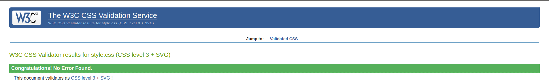
 This is for the style.css file:
Conclusion
In conclusion, this project has been an enriching experience, allowing me to develop and showcase my web development skills. From learning HTML and CSS to implementing responsive design and debugging, each step has contributed to my growth as a developer.
I look forward to applying these skills to future projects and continuing to learn and evolve in the field of web development.
References
I couldn't have completed this project without taking references from various online websites,videos and forums.
I have taken references for the homepage and hamburger menu by following This video
I have used W3Schools, The Odin Project, Stack Overflow, Reddit for debugging, checking the correct syntax, finding the correct implement of HTML tags and different properties of CSS.